Redesigning Southeastern's Railway Map
Abstract. Southeastern’s London suburban “metro” network is a complex system consisting of many different routes and termini, which are often misrepresented on official maps. As such, I decided to attempt to design my own version of the network map to better visualise service patterns.
This year, I made the decision to start commuting to university as the cost of student accommodation continues to rise in london. I learned quickly to navigate the commuter network’s quirks, alternating between services and rushing between trains to get to the many different stations where my university’s campuses lie. Fortunately, however, all of them sit on the Southeastern network.
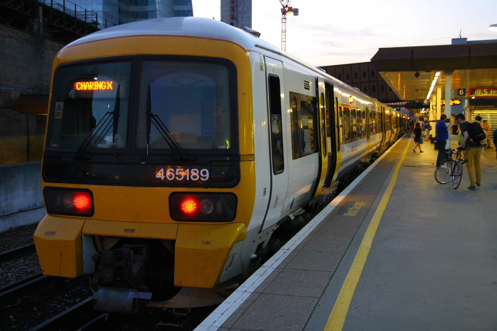
One evening, stranded at Lewisham after a missed connection, I took a closer look at the map on the wall. Everything from the metro network’s Cannon Street loop service to express trains from the Kent coast was rendered in a single dark blue stroke. Compared to the chaos of my daily commute, it felt disappointingly simple.
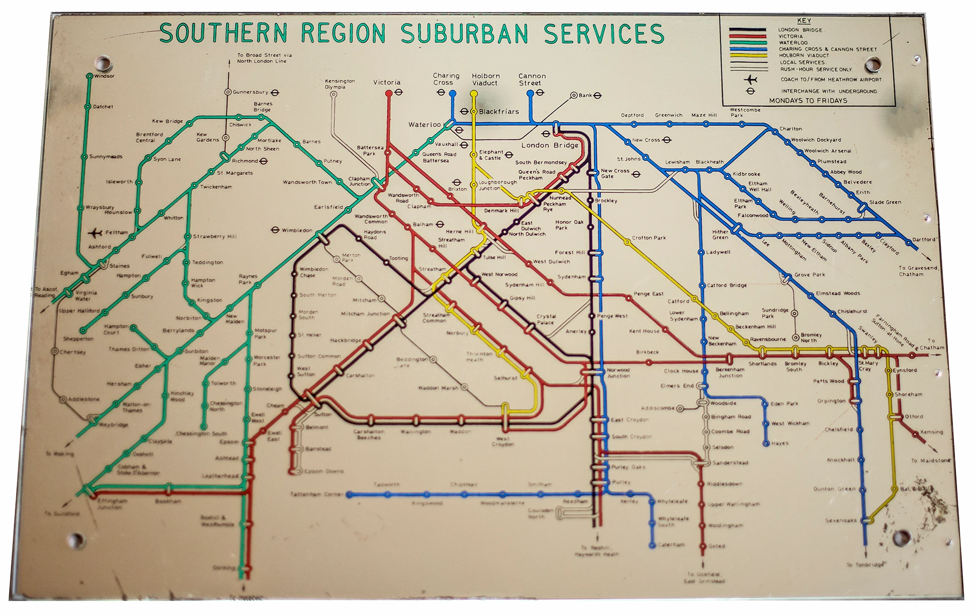
1960s British Rail, line colours denote different service termini.
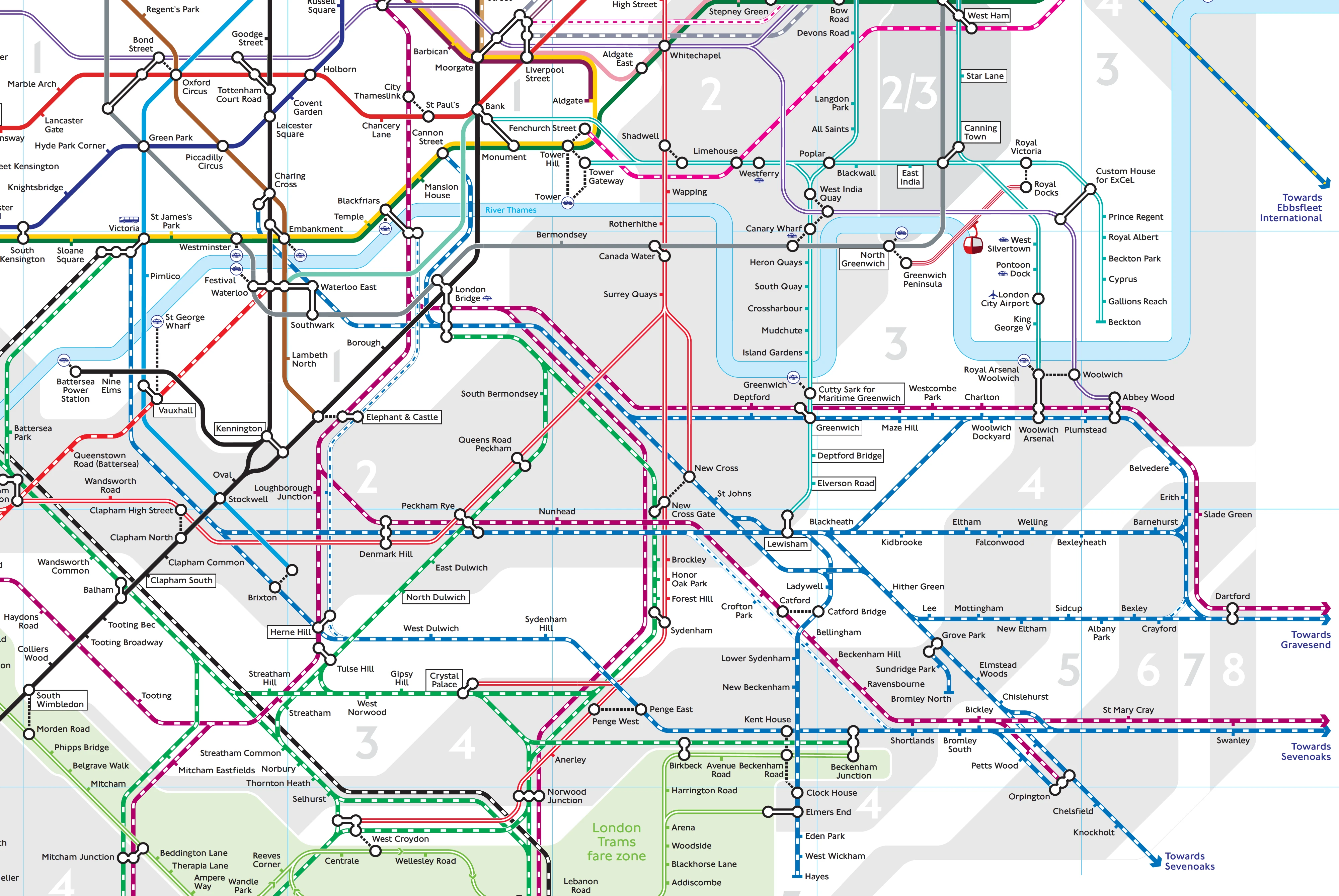 2025 TfL Tube and Rail servies extract, colours by train operating company.
 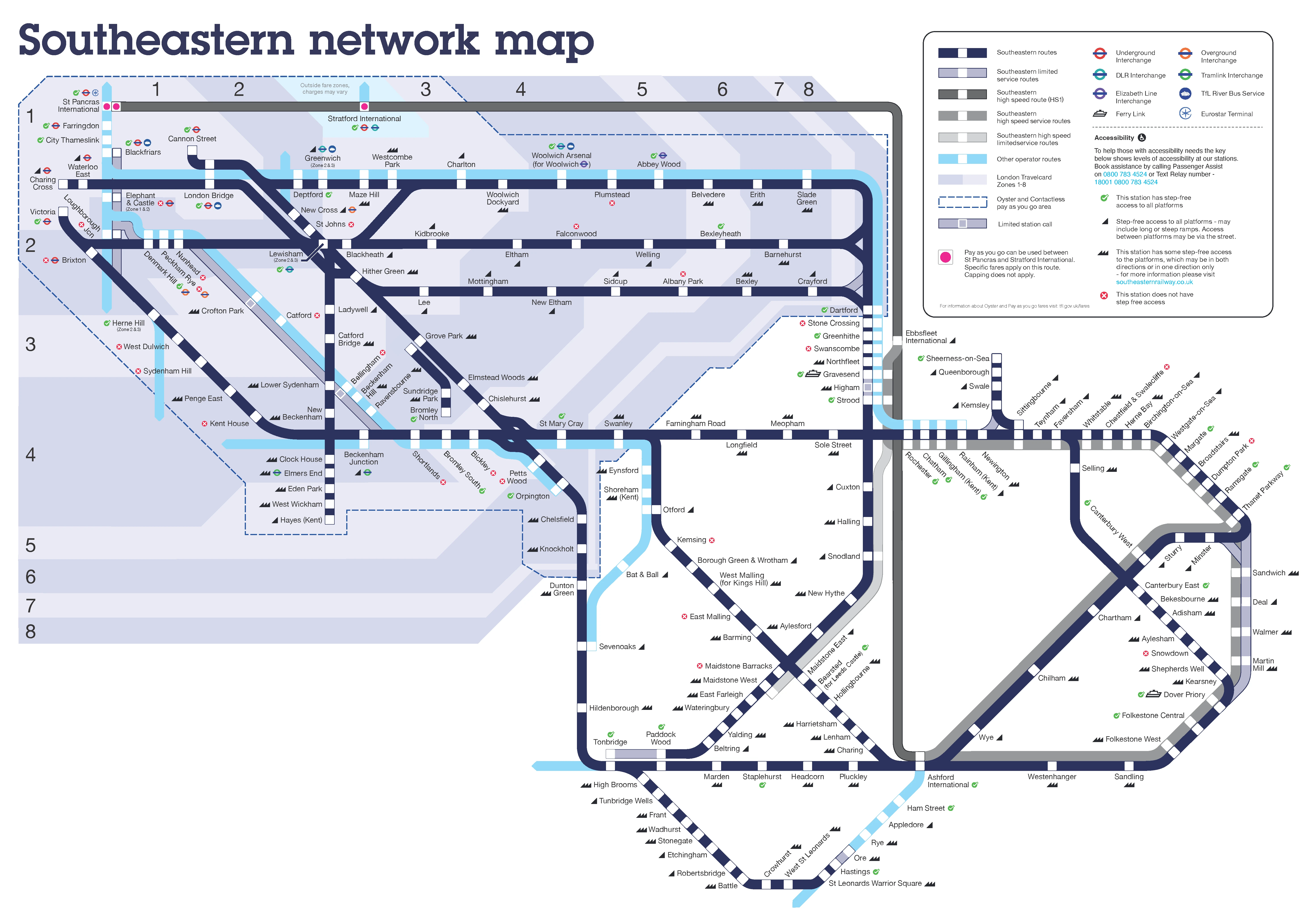 2025 Southeastern Network services map, single line and colour for majority of network.
 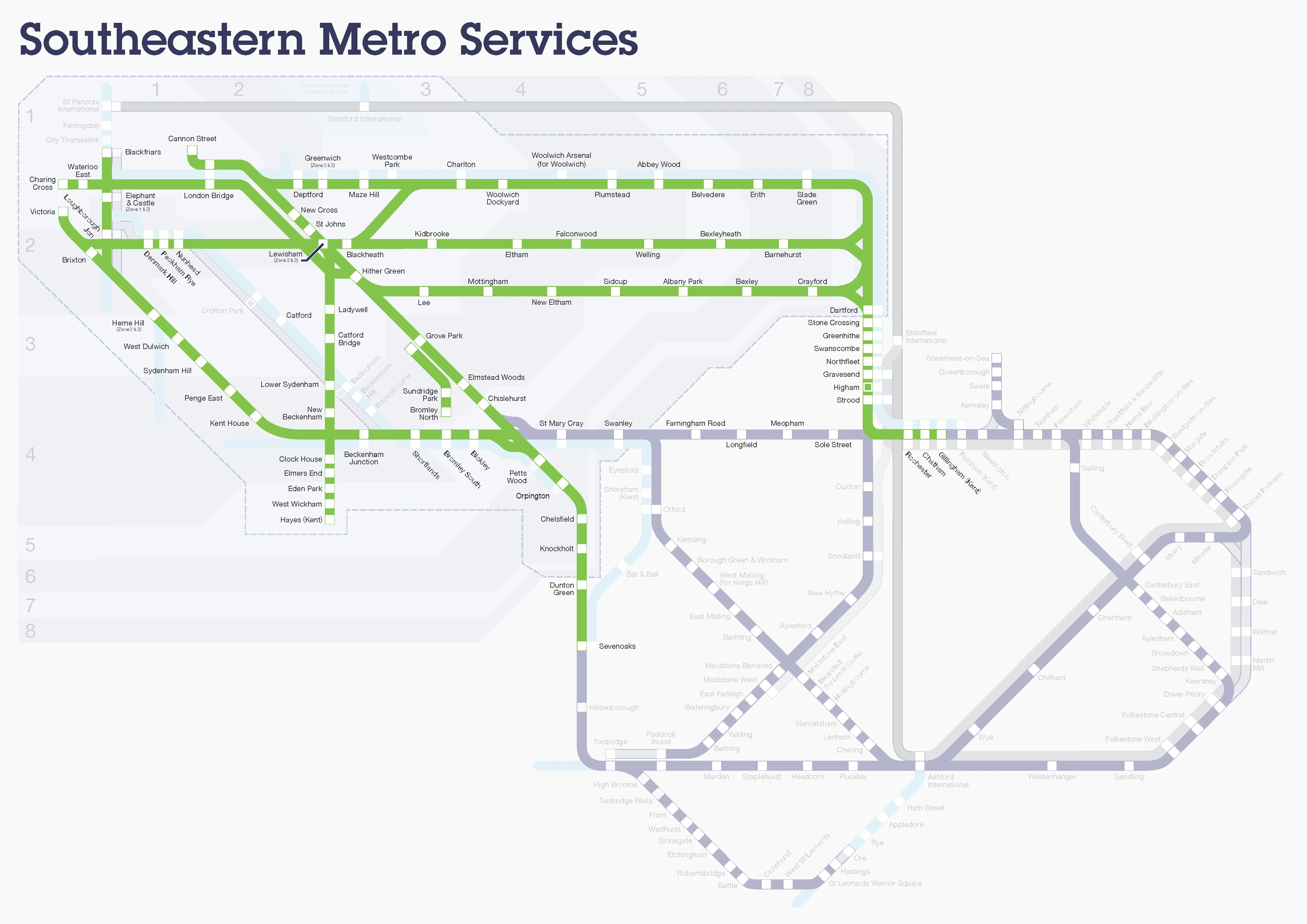 Southeastern Metro service map: simply a highlighted version of the main map
 Research
Searching online, I found that most maps use the single line style. I was particularly horrified to discover an official Southeastern Metro Services map (??) that simply highlights London’s commuter region in bright green.
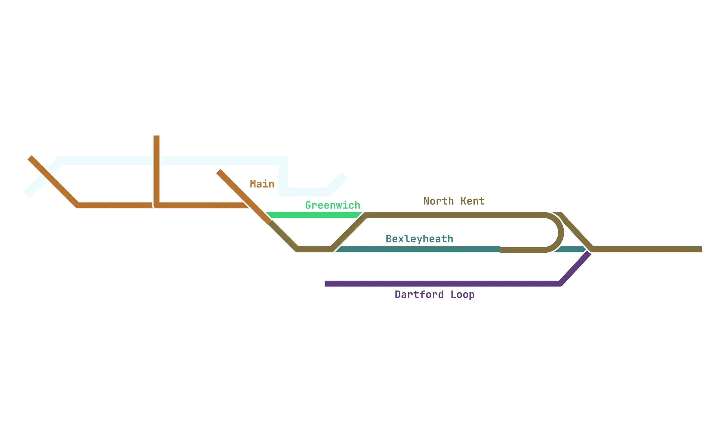
However a bit more digging revealed this wasn’t always the case. Before the 2021 Government takeover , the previous operator, Govia, had actually attempted to colour-code and name individual routes, albeit with the same crudely highlighted maps. Remnants of this branding remains: this notice board (??) spotted at Waterloo East bears a slight resemblance to those seen on the Tube.
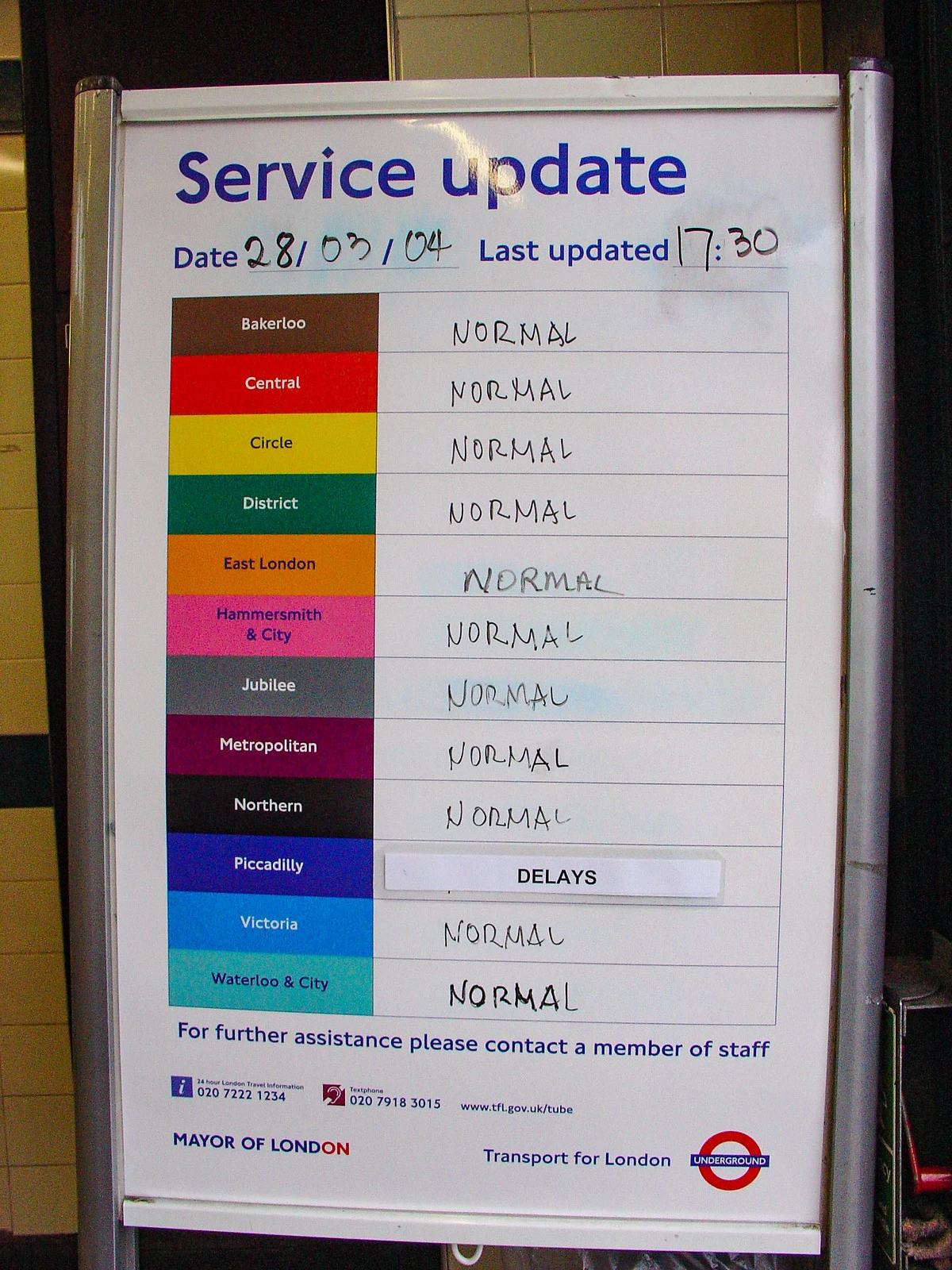
Tube service update whiteboard
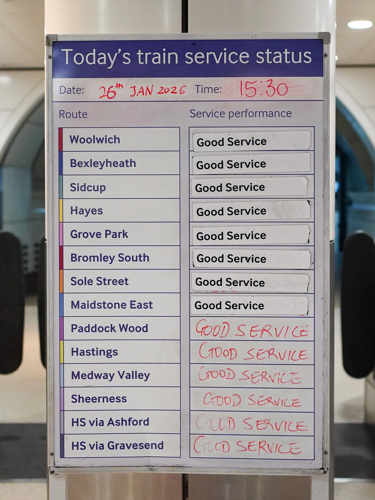 Southeastern lines service status board still in use at Waterloo East Station
 As a matter of fact, route clarity used to be standard on this network. Many may actually remember the route headcodes displayed on the front of Southeastern trains until as late as 2009 (??). Much like bus numbers, these two digit codes signalled the stopping pattern to commuters and staff instantly—although there was some discontinuity post-privatisation, a full list of British Rail era headcodes still exists online!
It will be interesting to see how the new Great British Railways and TfL decide to handle branding for London’s suburban rail network, and if individually numbered routes will ever return to the commuter railway. Perhaps we could even see them integrated into maps, just like on the continent.
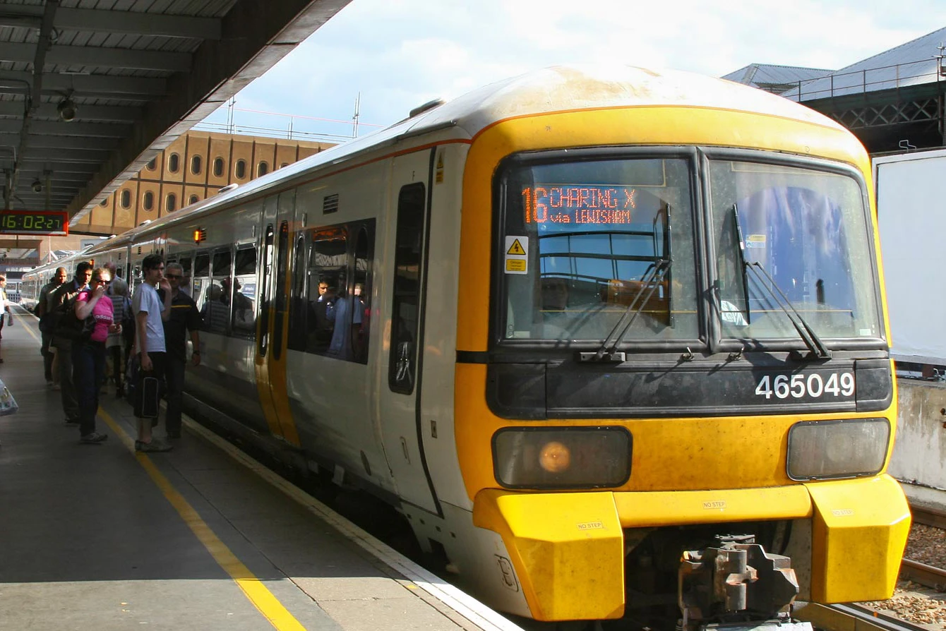
Train displaying route code 16: Charing Cross via Lewisham (2009)
Train with just the destination, Charing Cross, displayed (2011)
With this historical context in mind, and after looking at some examples on Cameron Booth’s excellent Transit Maps blog, I made the bold decision to give map design a go myself!
Design Process
Having prior experience with vector software, I decided to use Affinity Designer (which is now free for all following the Canva acquisition) for my design. However, after sketching a few principal routes, I quickly realised that this would be no simple task. Southeastern’s timetables were difficult to interpret, and the sheer amount of routes made the approach to Charing Cross difficult to draw.
 Experimenting with different ideas.
 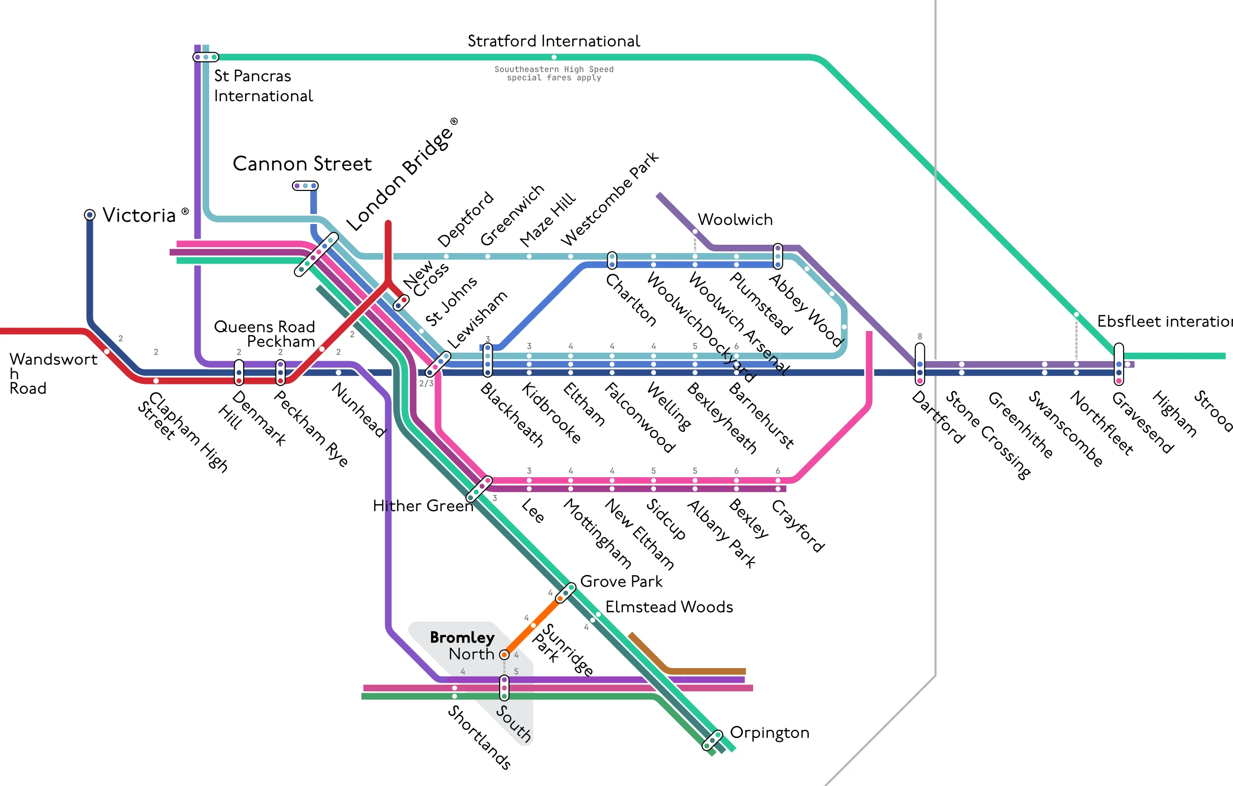 Running out of space!
 After a steep learning curve, involving understanding curve radii and fiddling with font sizes, I was quite proud of the draft I had created . It contained the majority of routes I use, even including Thameslink services as well as the Windrush and Elizabeth lines.
However, I quickly realised that with this draft, there was simply not enough space for the rest of the network, I needed to be more efficient, which ultimately resulted in abandoning the Elizabeth and Windrush lines and returning to the drawing board with a stricter focus.
 Sketch of Dartford lines
 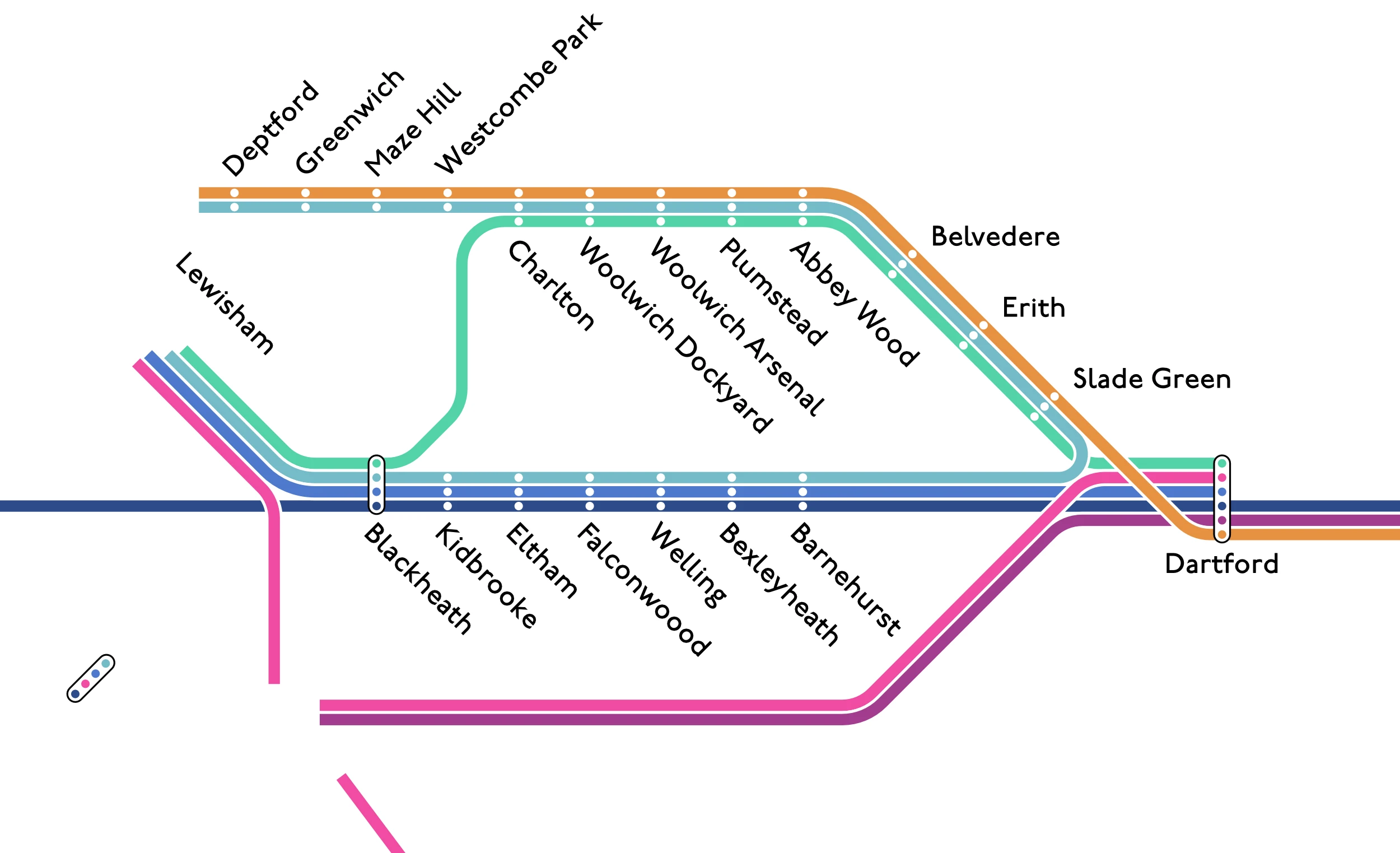 Experimenting with greater radii and different styling
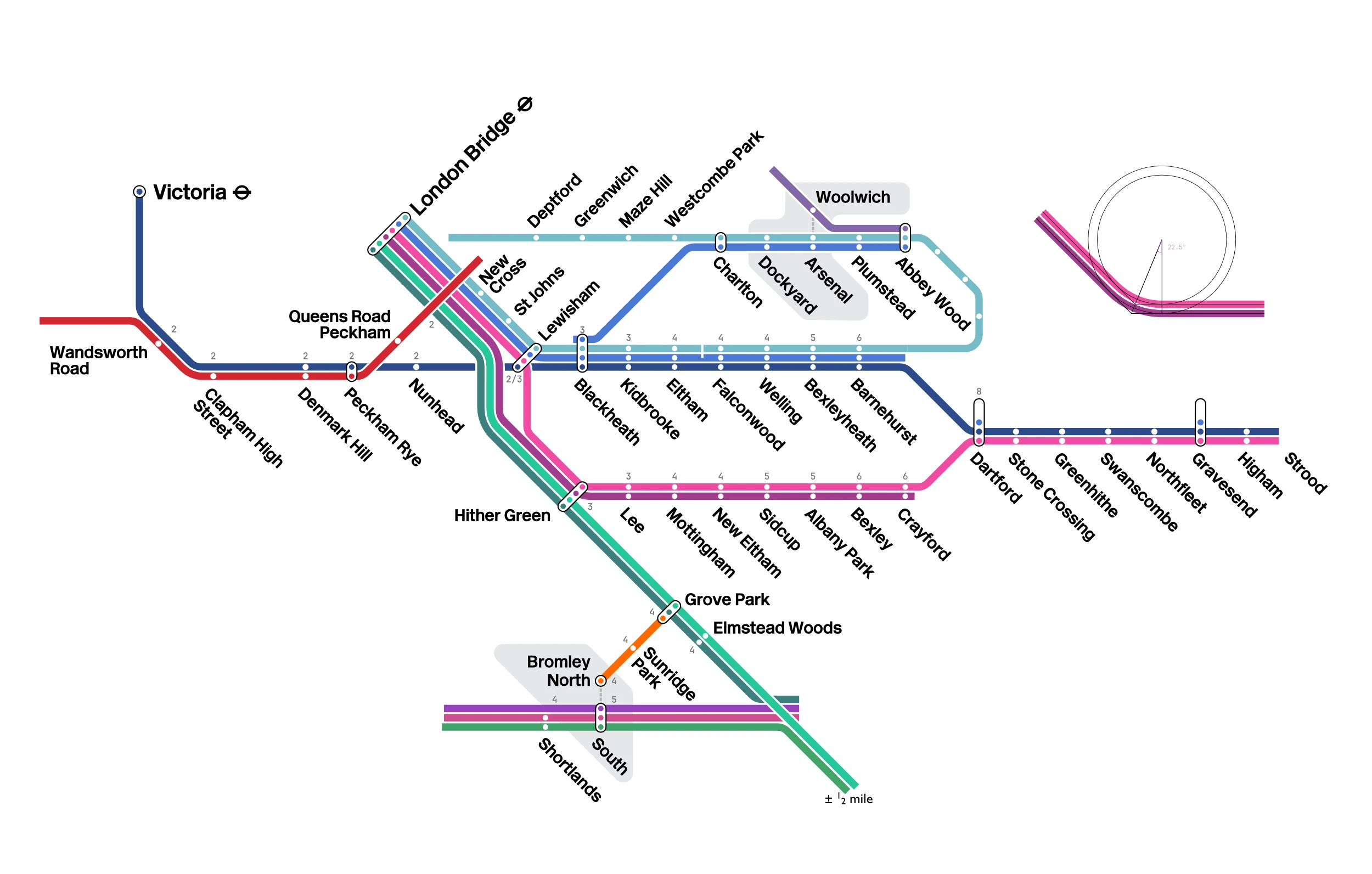
 For the second attempt, I sketched a rough skeleton of the Dartford lines to establish a baseline, and also attempted new styling with greater curve radii. Using Realtime Trains, I scoured through timetable data to identify a total of 23 off-peak services that stop in the metro area which I then began to draw individually, and after a few days of work, finally arrived at a finished product.
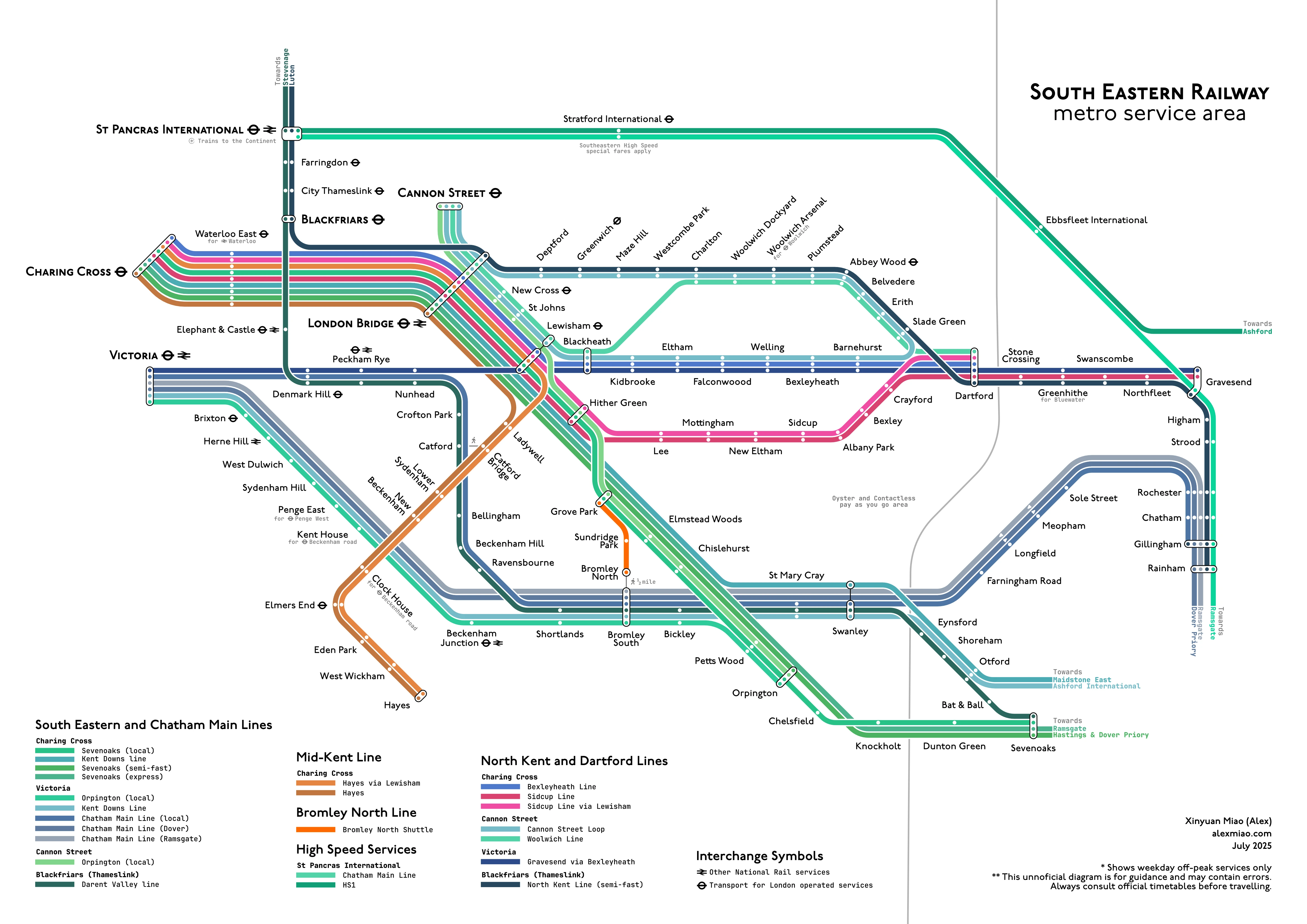
Figures 7, 8 and 9 show comparison between different parts of my unofficial redesign, and other official maps.
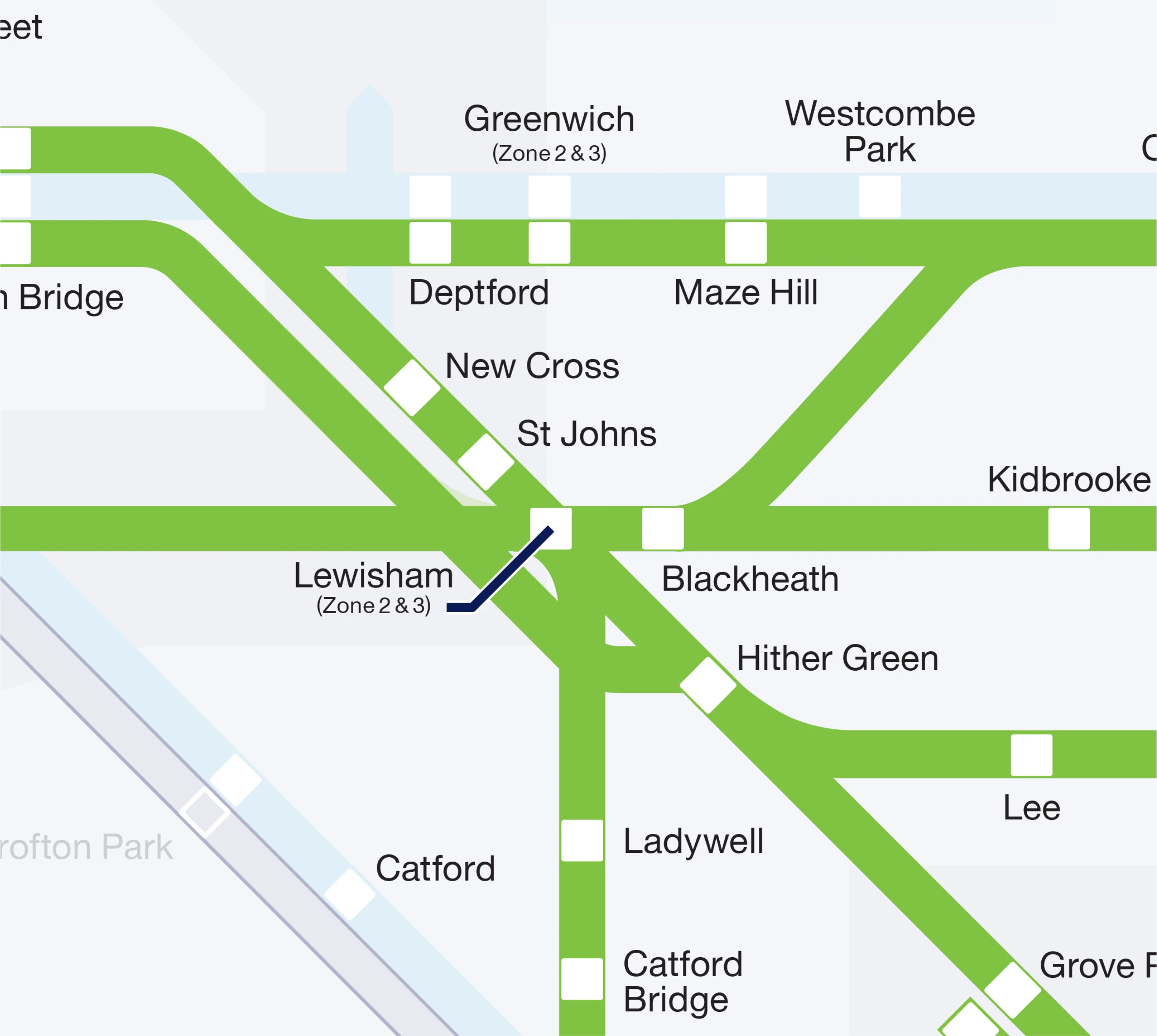 Southeastern Metro
 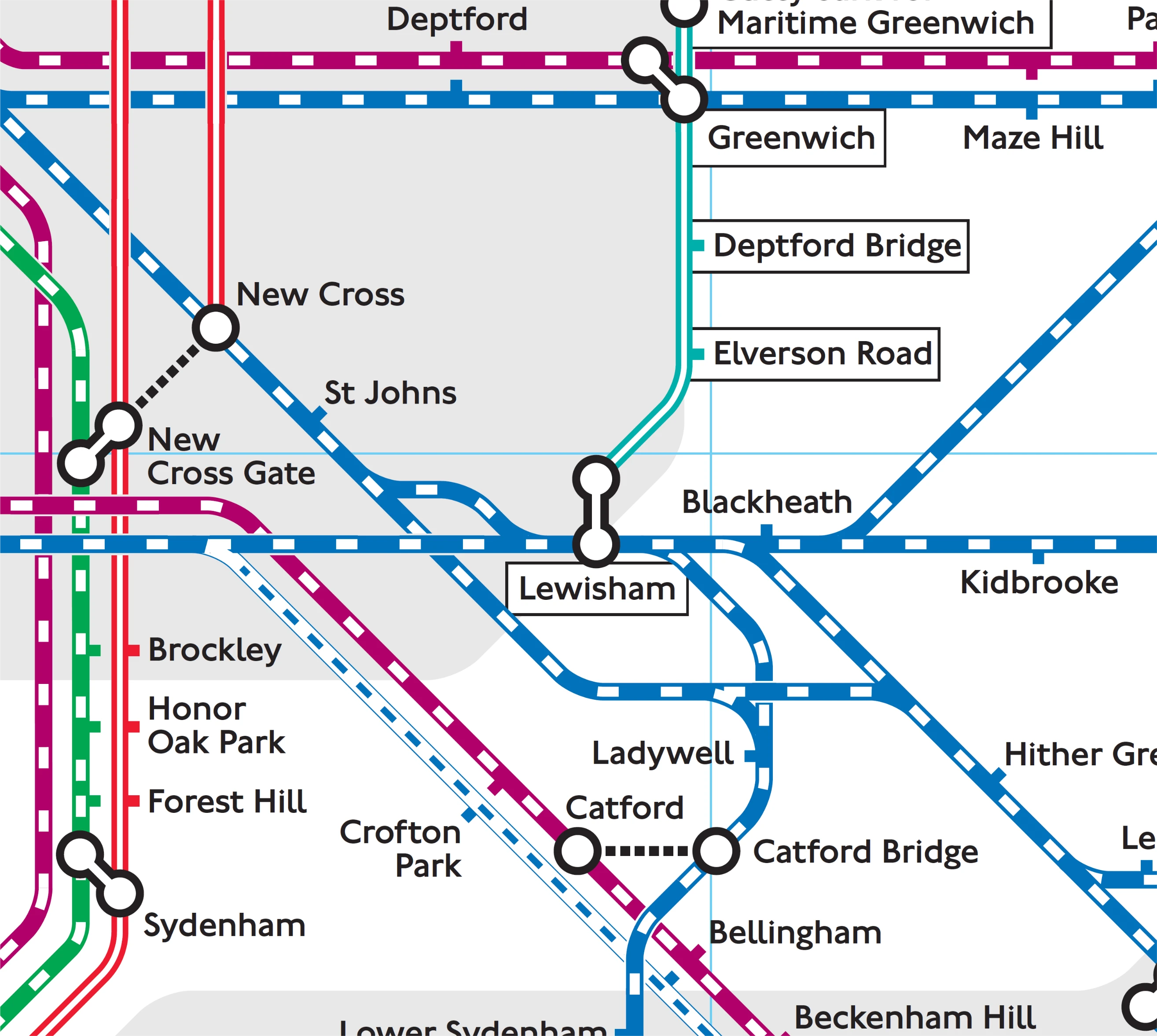 TfL Tube and Rail
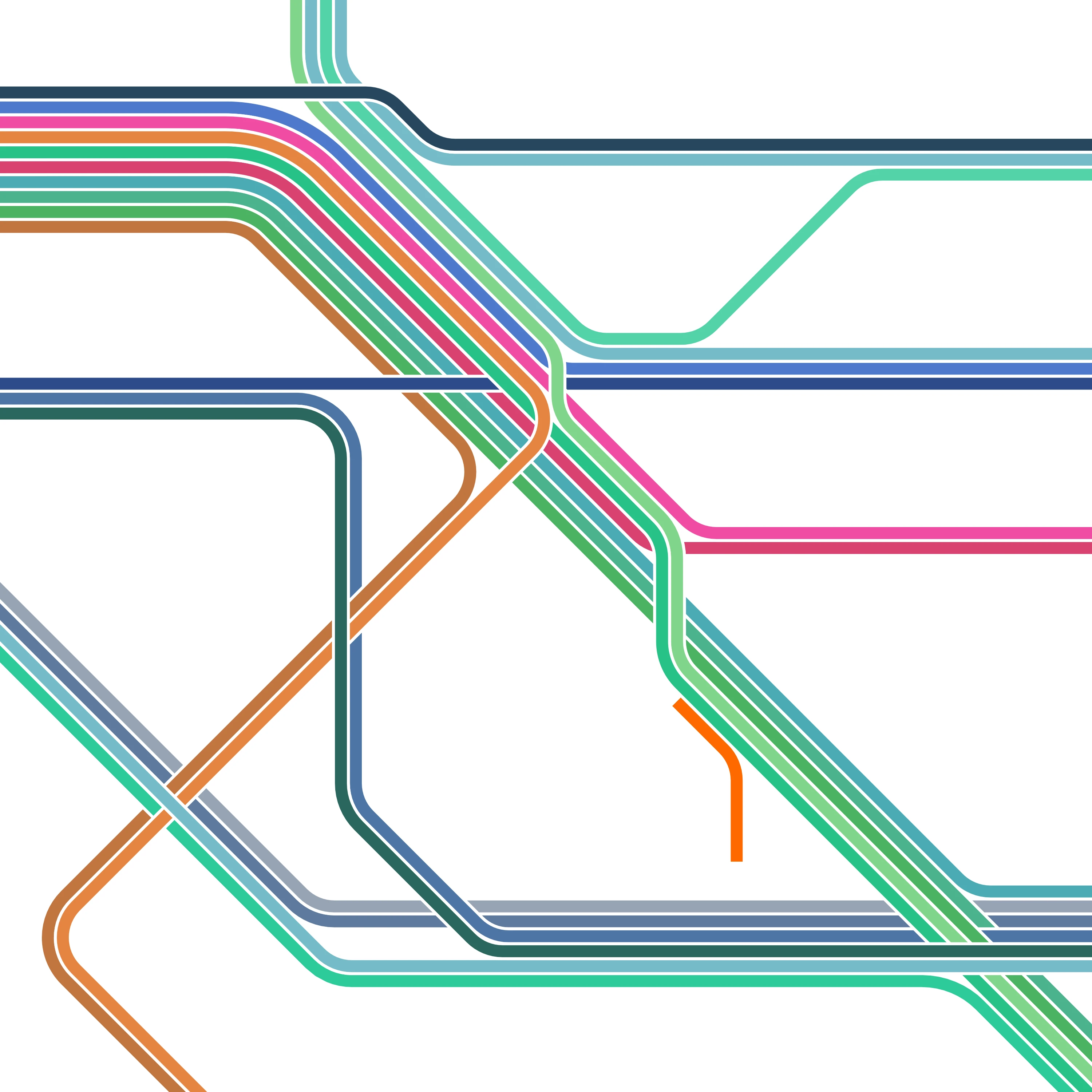
 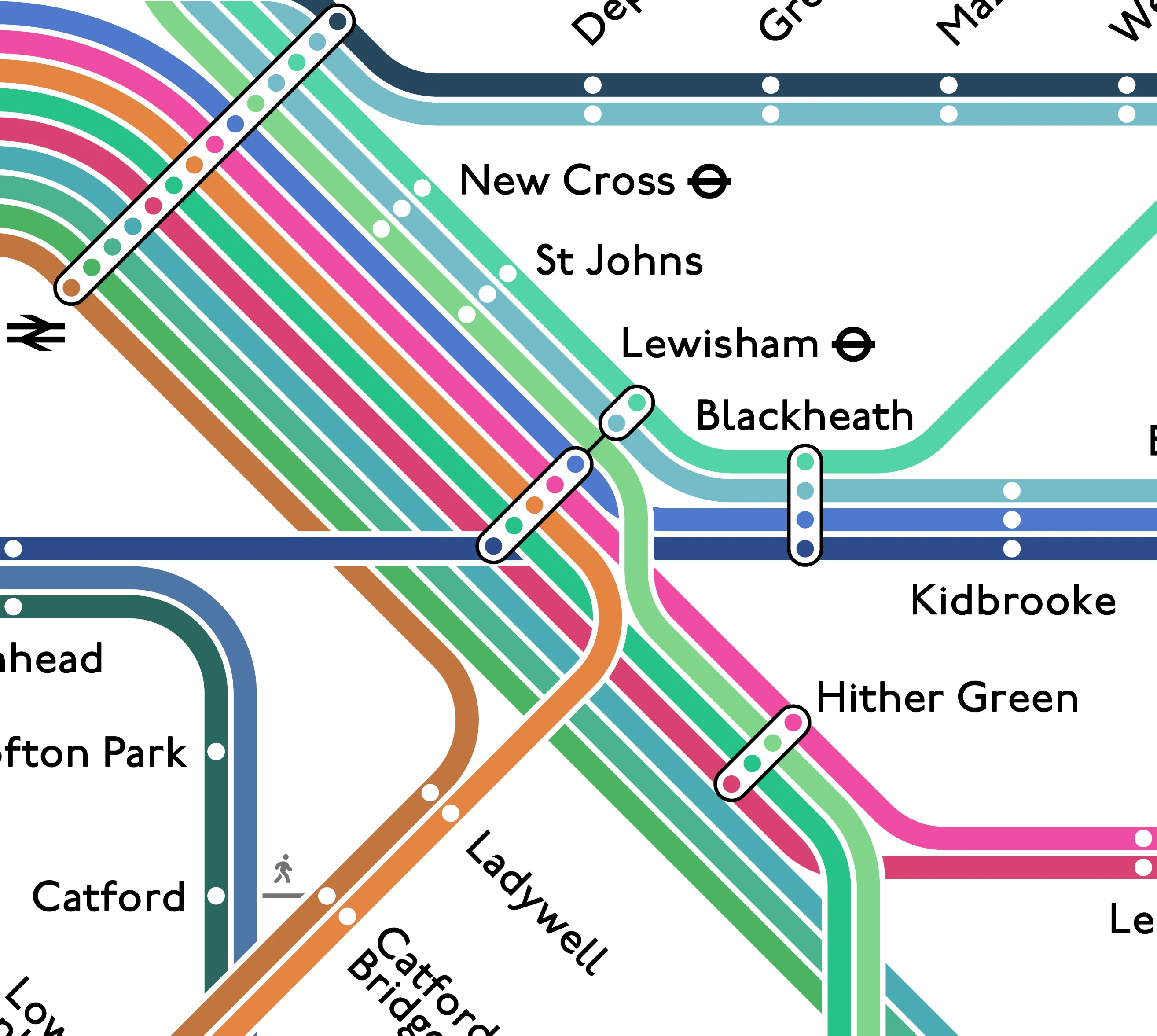 My unofficial Redesign
 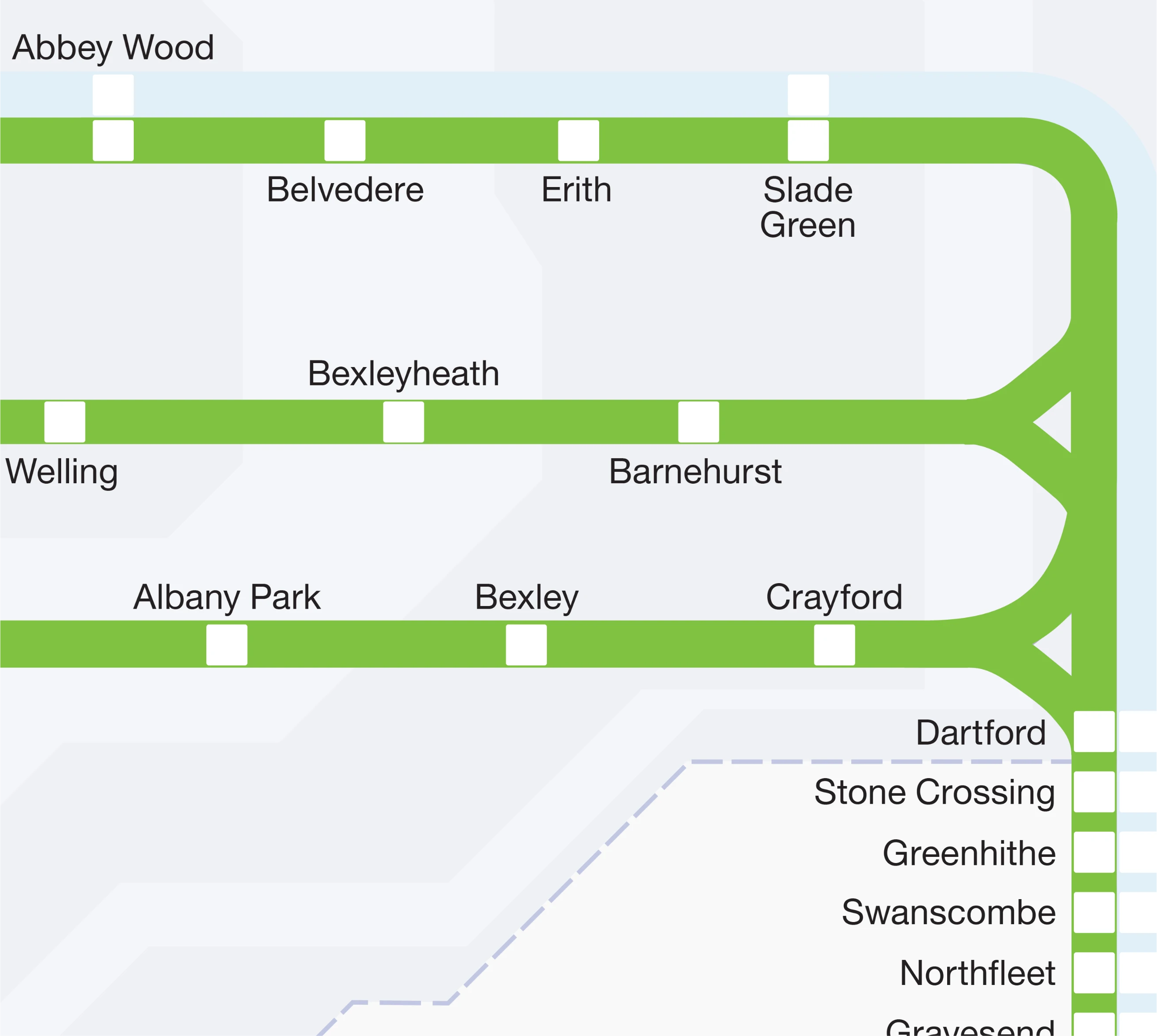 Southeastern Metro
 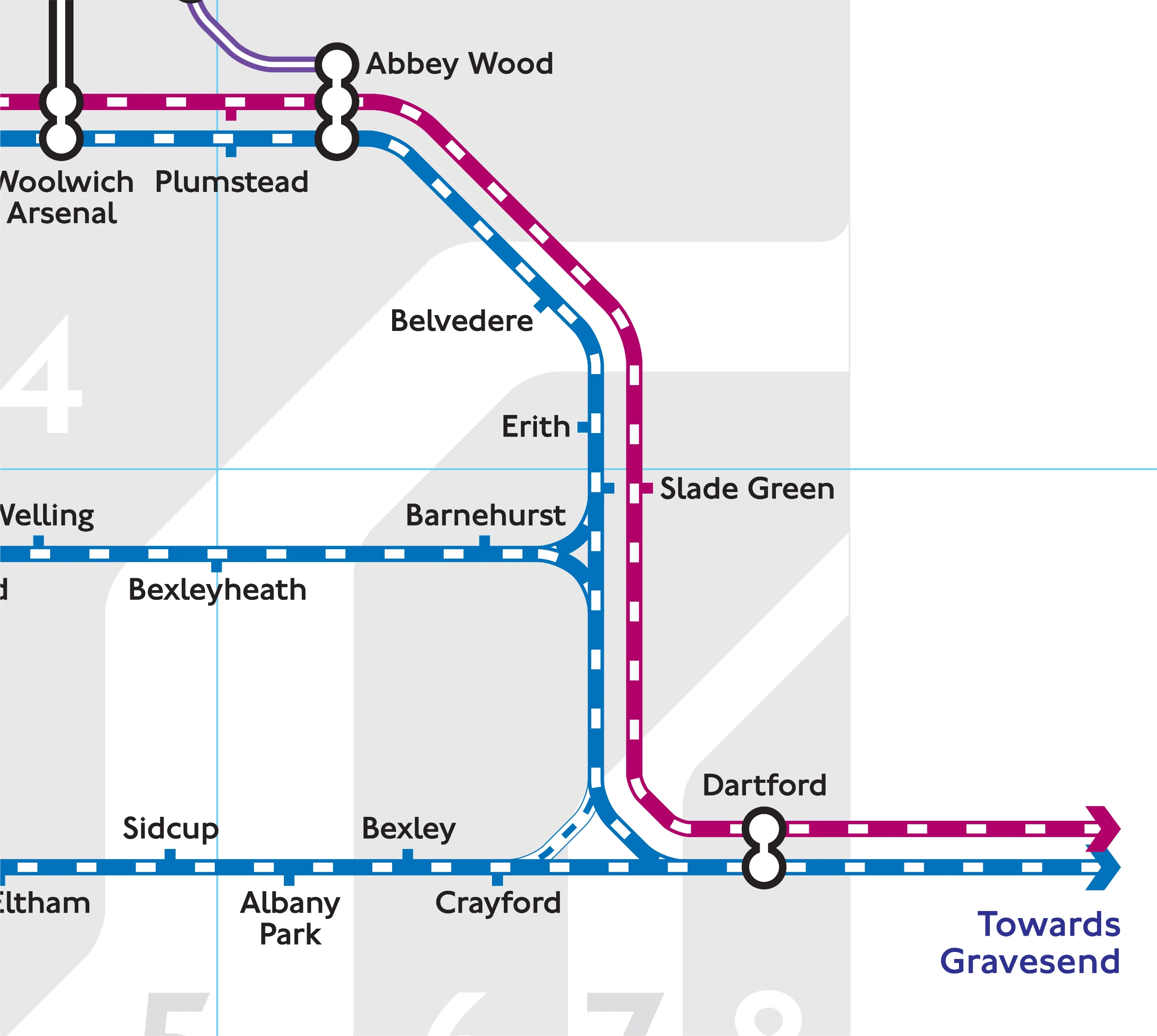 TfL Tube and Rail
 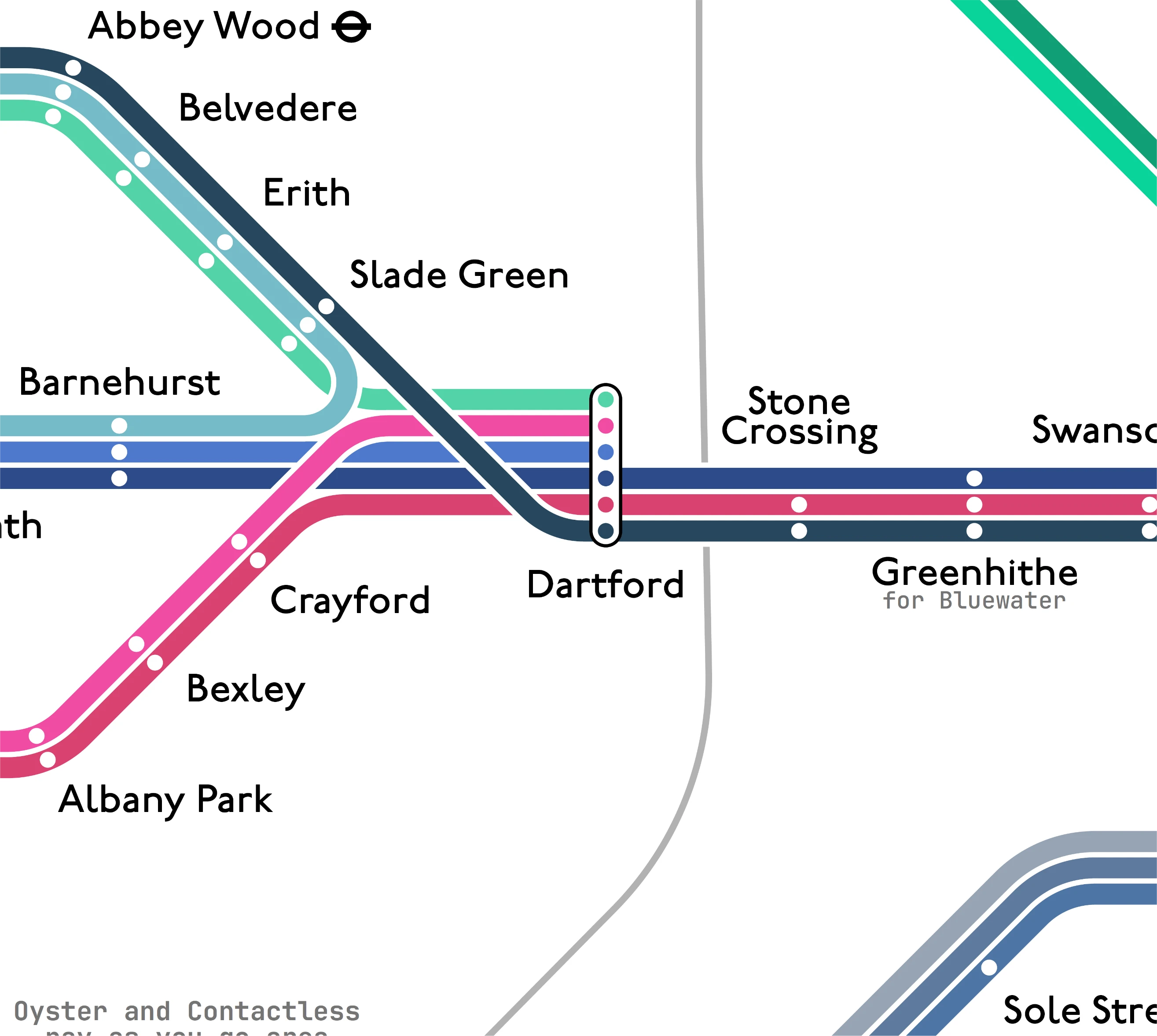 My unofficial Redesign
 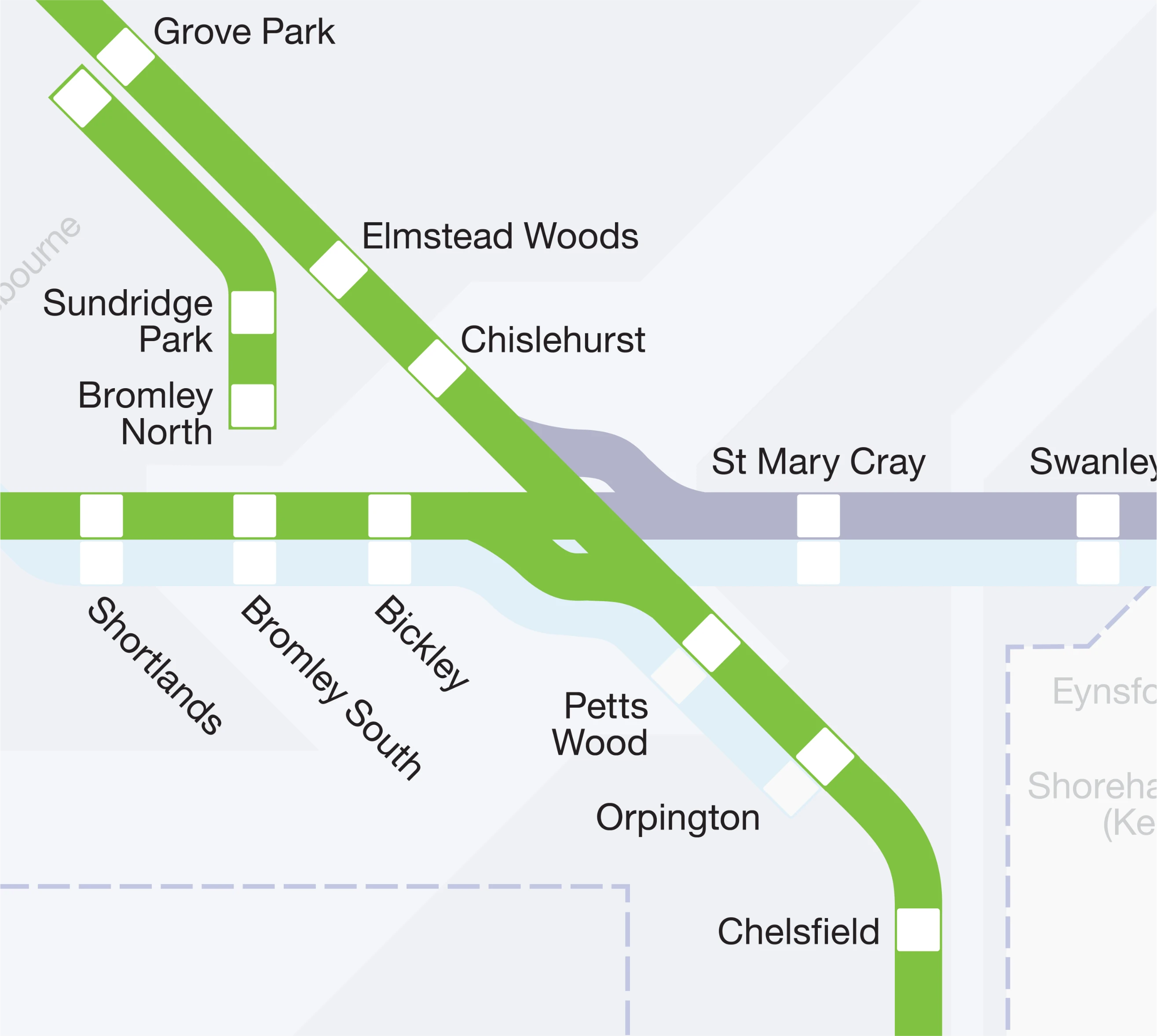 Southeastern Metro
 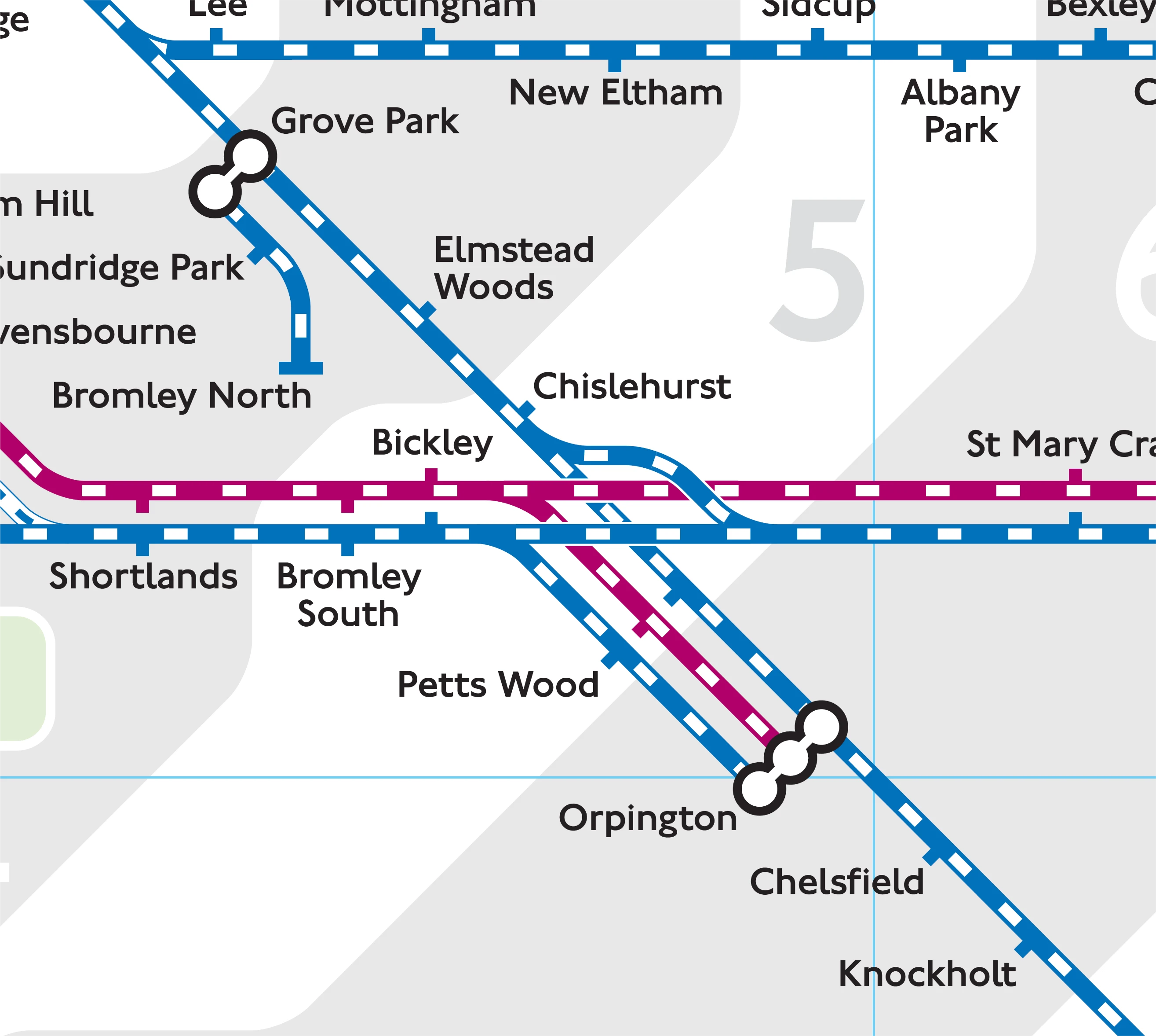 TfL Tube and Rail
 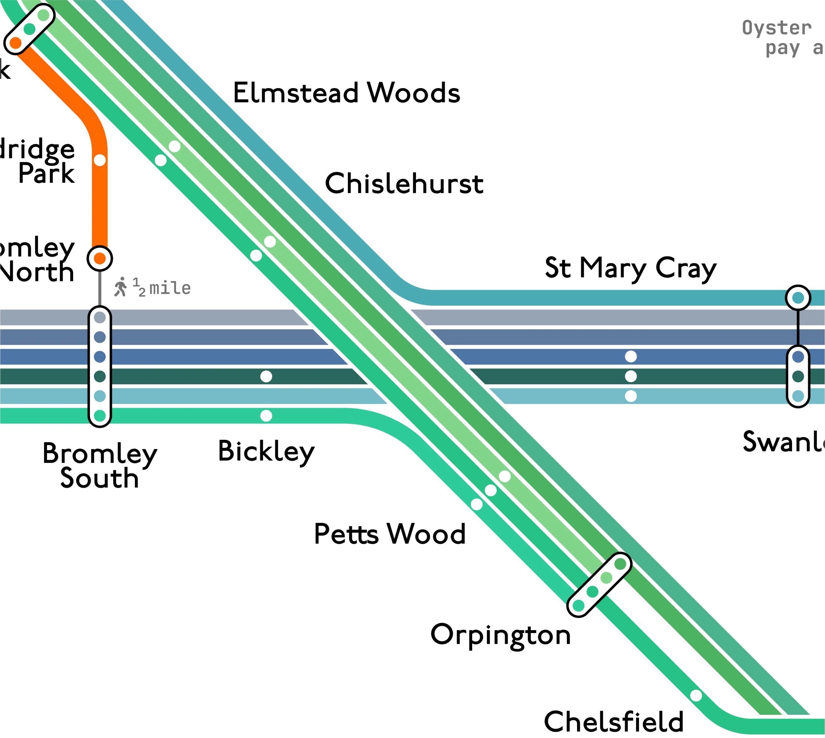 My unofficial Redesign
 Overall, I am quite happy with the result, though I do have a few critiques of my own design: the Lewisham interchange still lacks clarity for fast Sidcup trains (dark pink) and my decision to avoid merging lines, even when I perhaps should have, makes the map quite overwhelming at first glance.
Furthermore, while the map seeks to be as accurate to the off-peak timetable as possible, the reality is that the network seems to be more often than not affected by engineering works and diversions. So I’m not entirely sure about the real-life usability of my diagram, and I can now understand why the Southeastern team might have chosen to avoid creating such a detailed route map.
If you would like to take a closer look, feel free to download the PDF version.

)](/_astro/DesignElement2.C2g85uXc_Z267poG.webp)